

On Stripes, and Why They Hold Everything Together
On visual structure, iconic interiors, and the quiet confidence of a line.

Before I ever cared about interiors I cared about lines. Ballet will do that to you. You spend years trying to draw a line through your spine and another through your legs and another through the air in front of you. You try to send a line out past your fingers and pretend it is effortless even when everything is shaking. Most of the time it does not look effortless but the attempt shapes you. I think that is why I notice stripes the way some people notice the sky. A line that steadies. A line that releases. A line that reminds you to lift a little higher.
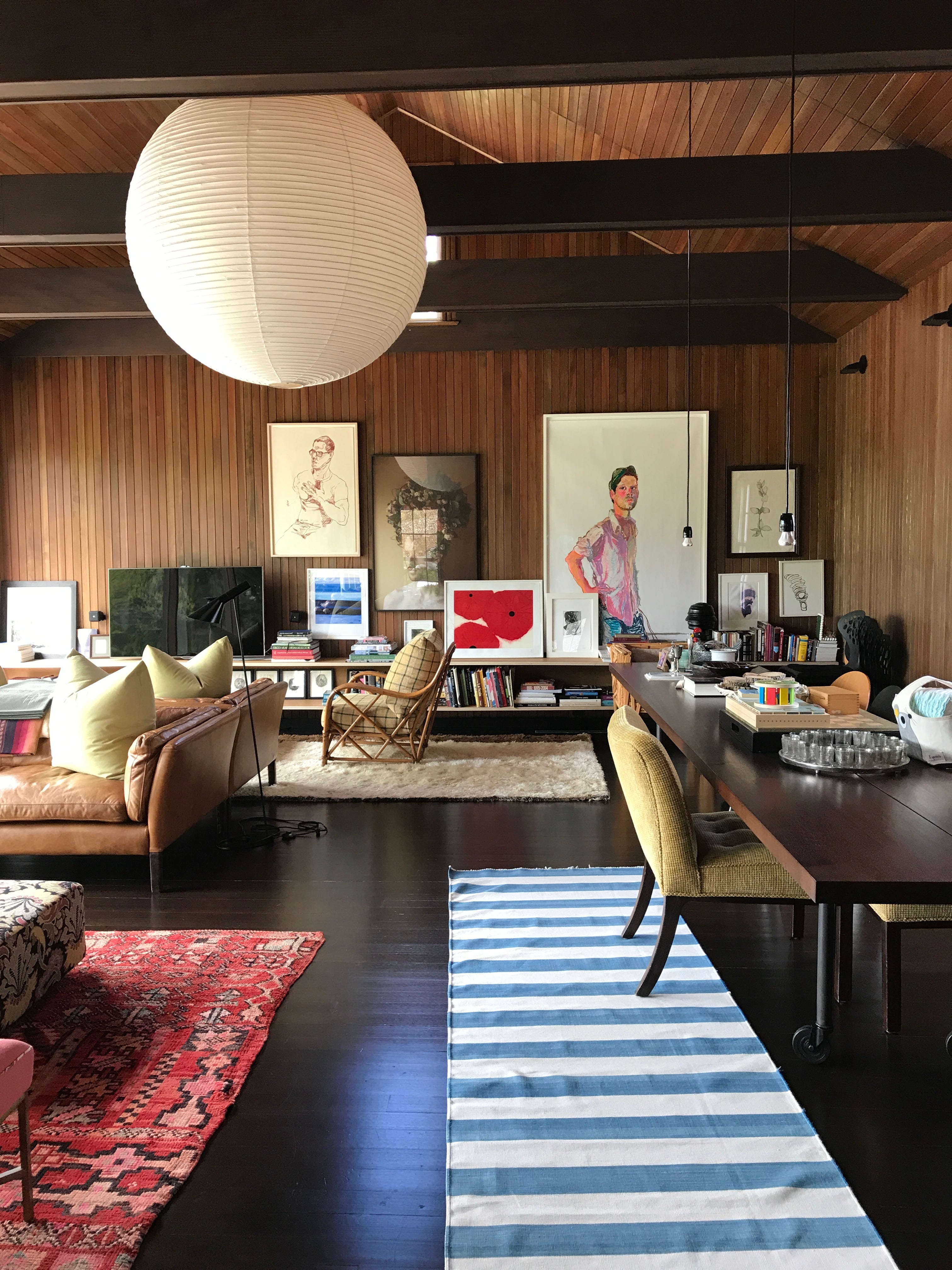
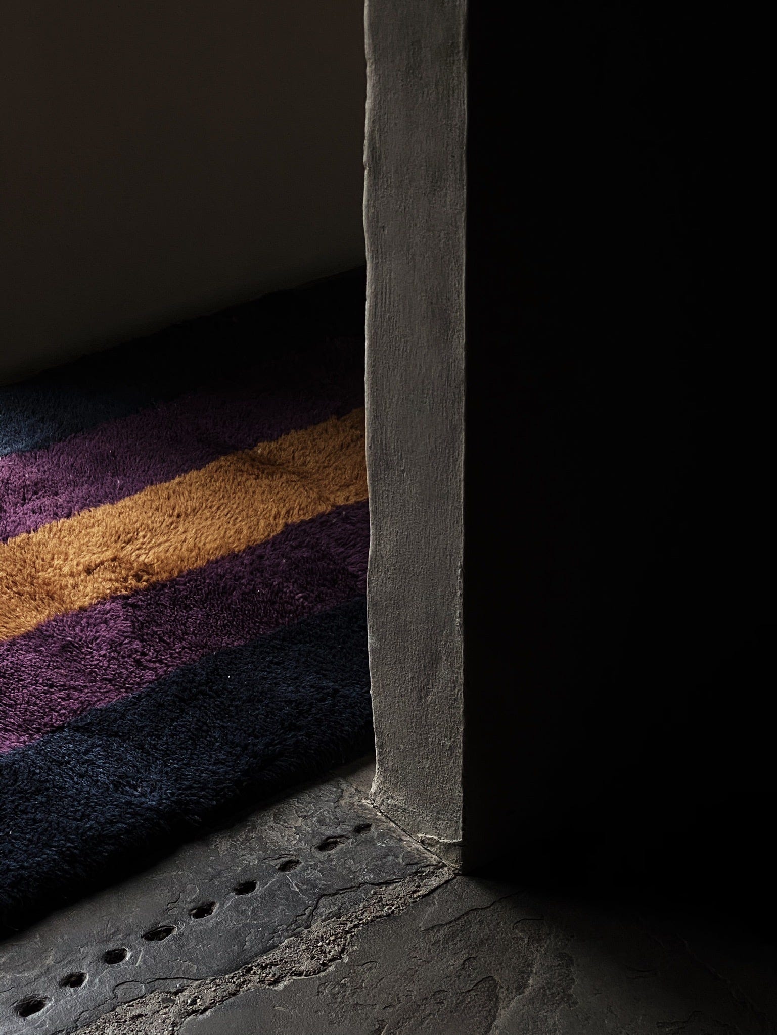
Stripes have a way of holding things. Not in the literal sense but in the way they carry a room giving it shape, giving it rhythm, giving it breath.
I have always been drawn to them. Not for their graphic punch but for their discipline. Their calm. The way they anchor space without overwhelming it. The way a single stripe, well placed, can carry more compositional weight than a dozen objects trying to do the same job.
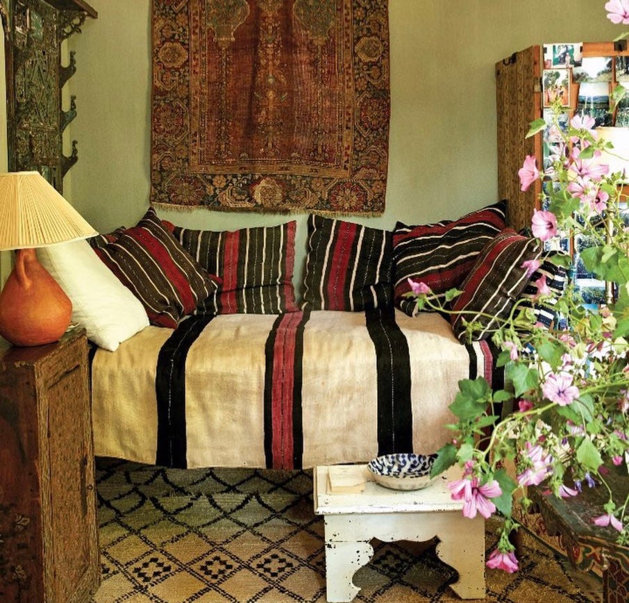
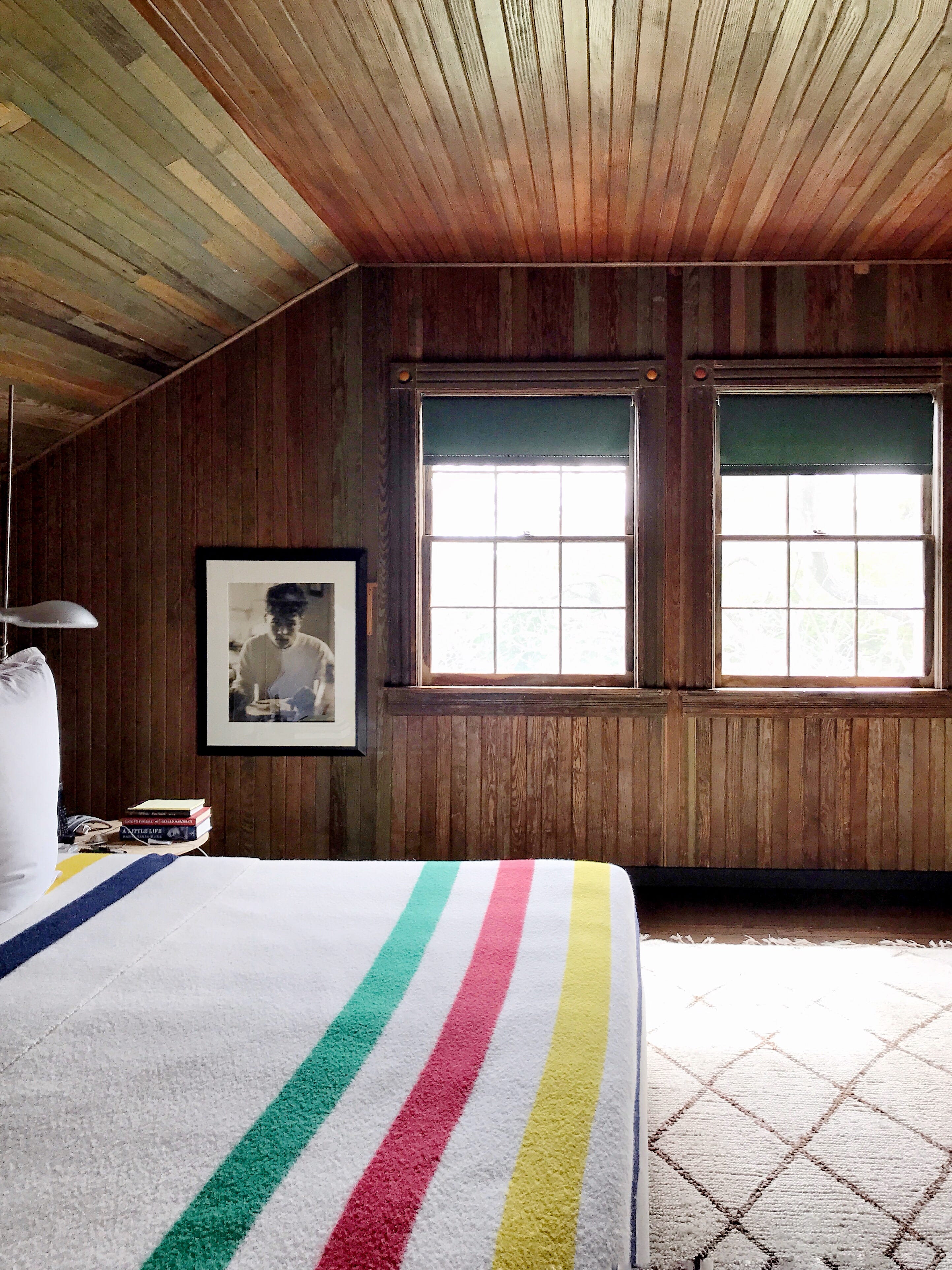
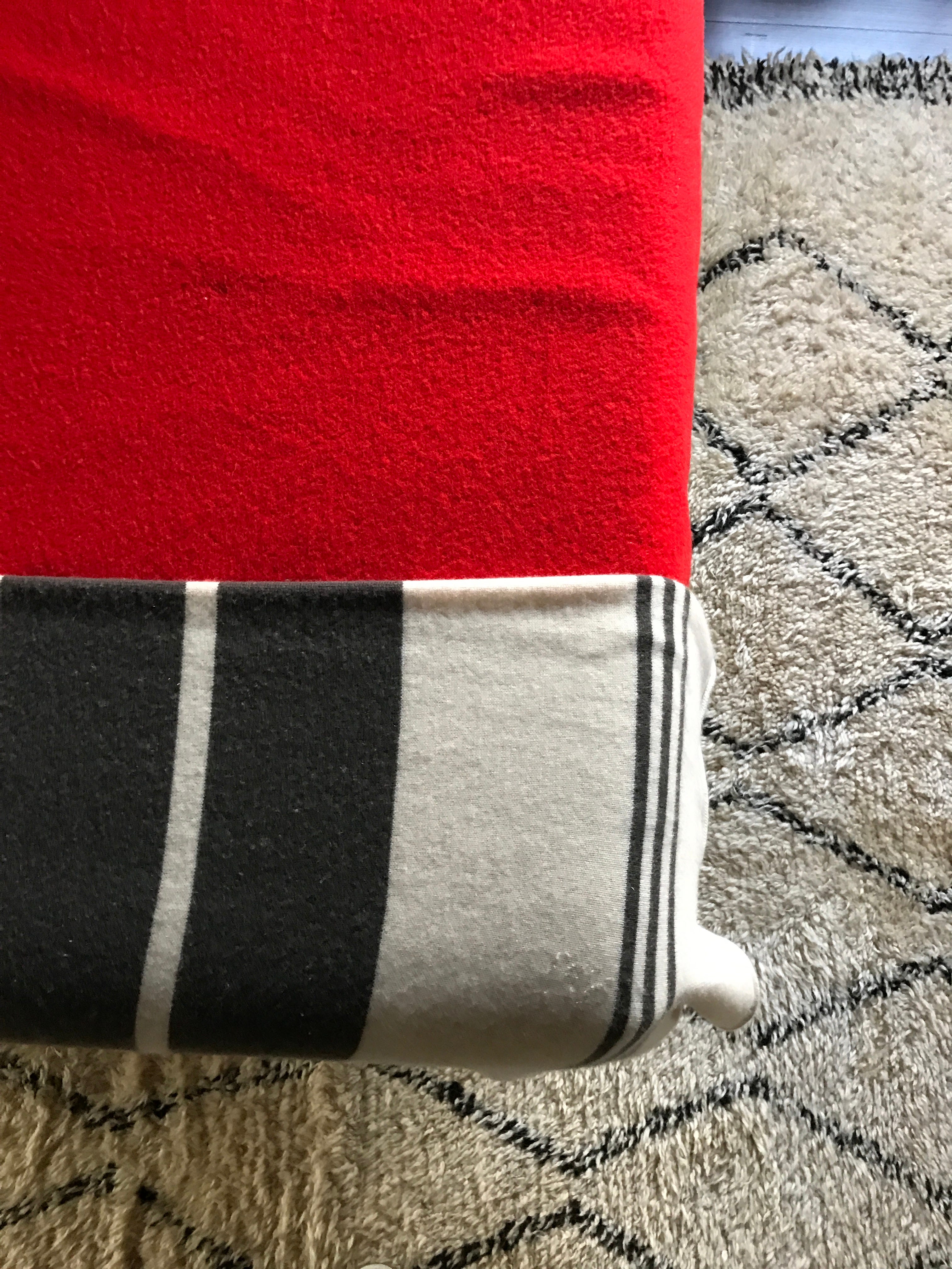
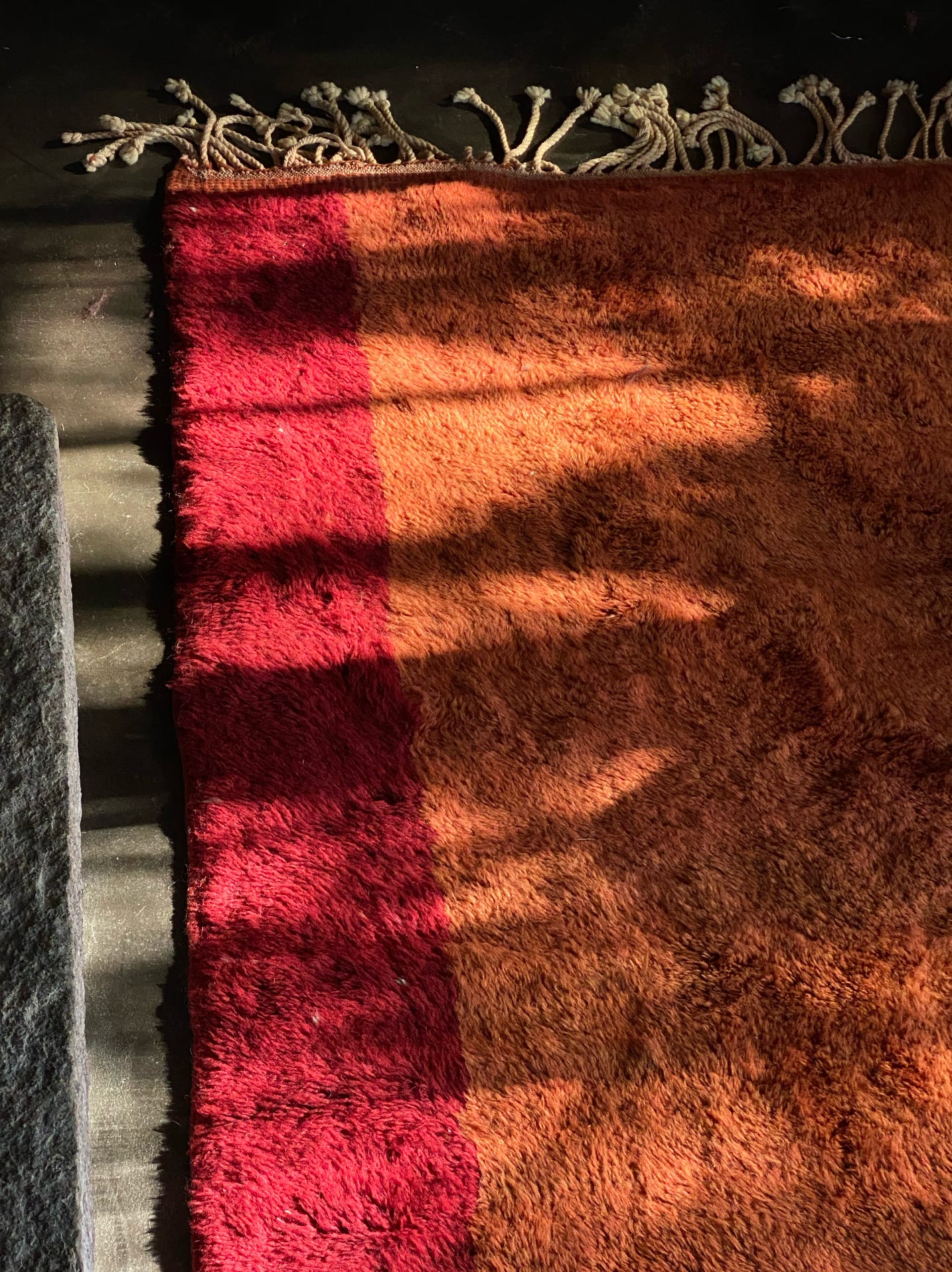
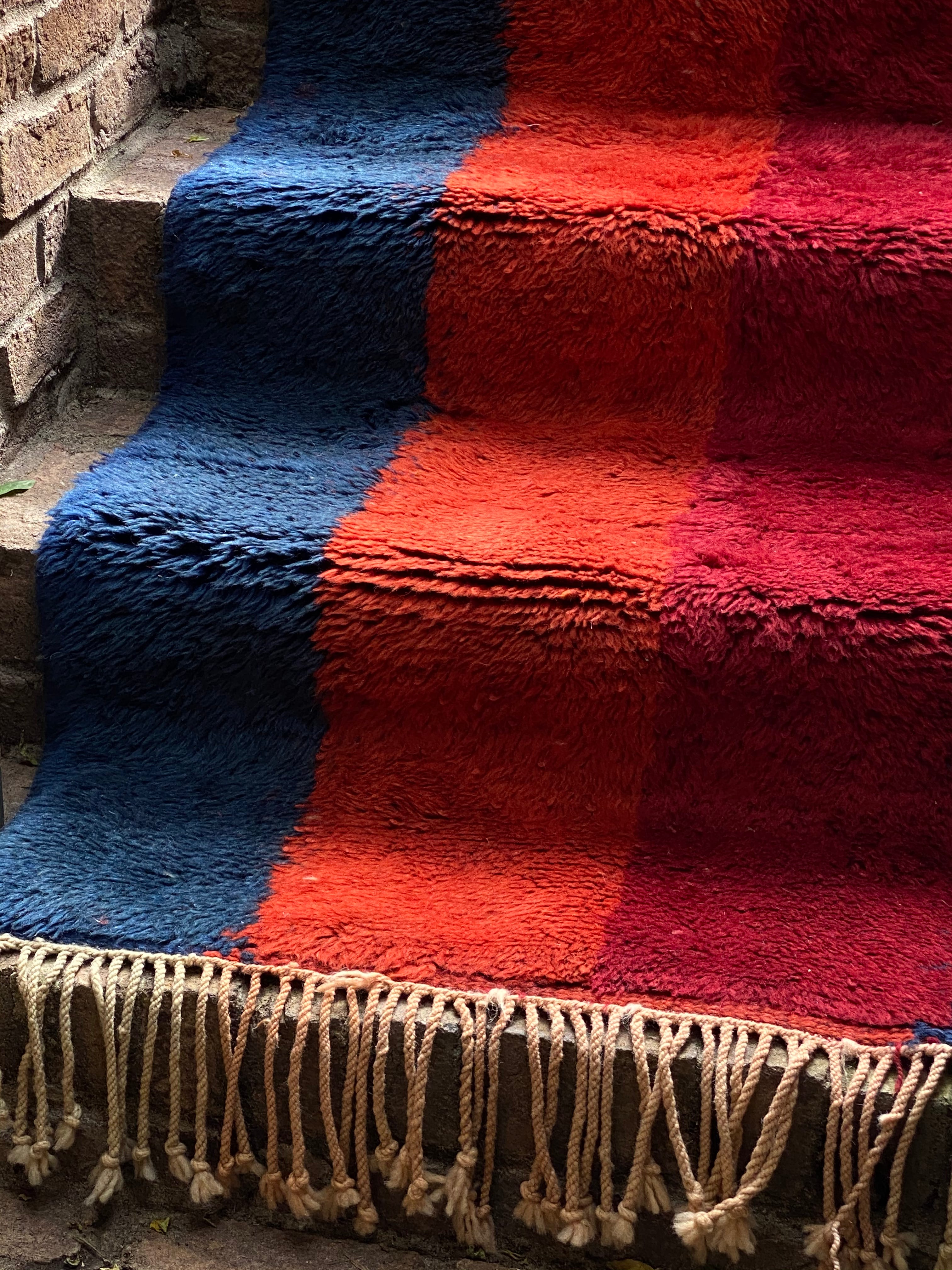
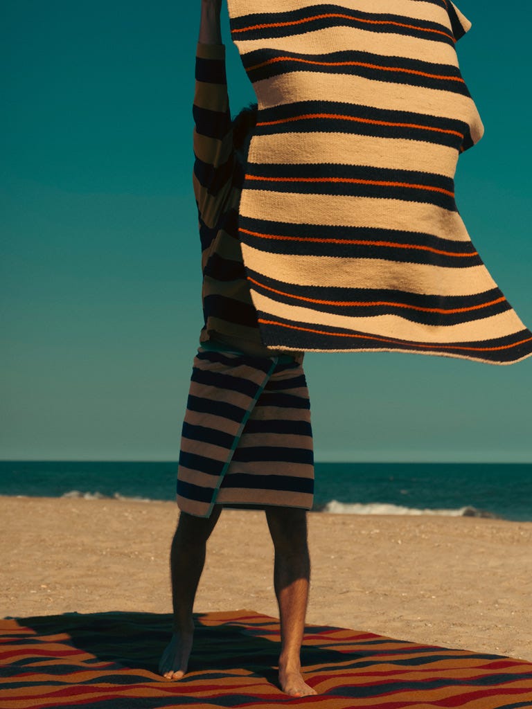
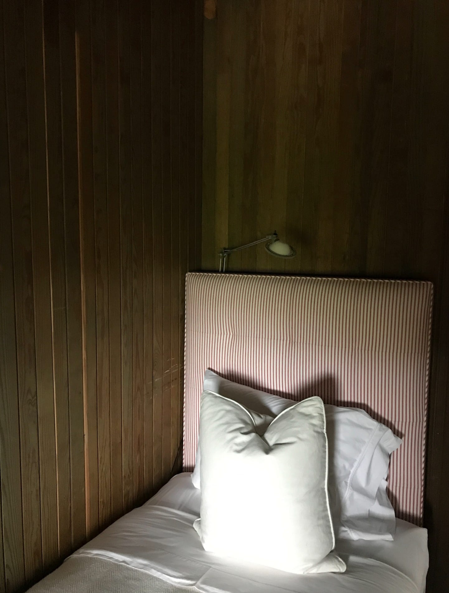
I used to think this was just a quirk of mine and then I realized I had been living with a Tuareg mat for almost a decade, its reed stripes worn soft at the edges like a favorite sentence. I still pull it out when a room needs grounding. I also designed stripe pillows for my collection with West Elm, because apparently I am a person with firm opinions about lines. And I love the Hudson’s Bay point blanket, which feels like the wilderness trained cousin of all other stripes. Straightforward, honest, and completely unfazed by our interior crises.
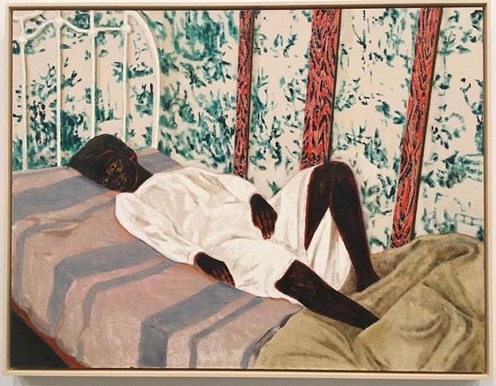
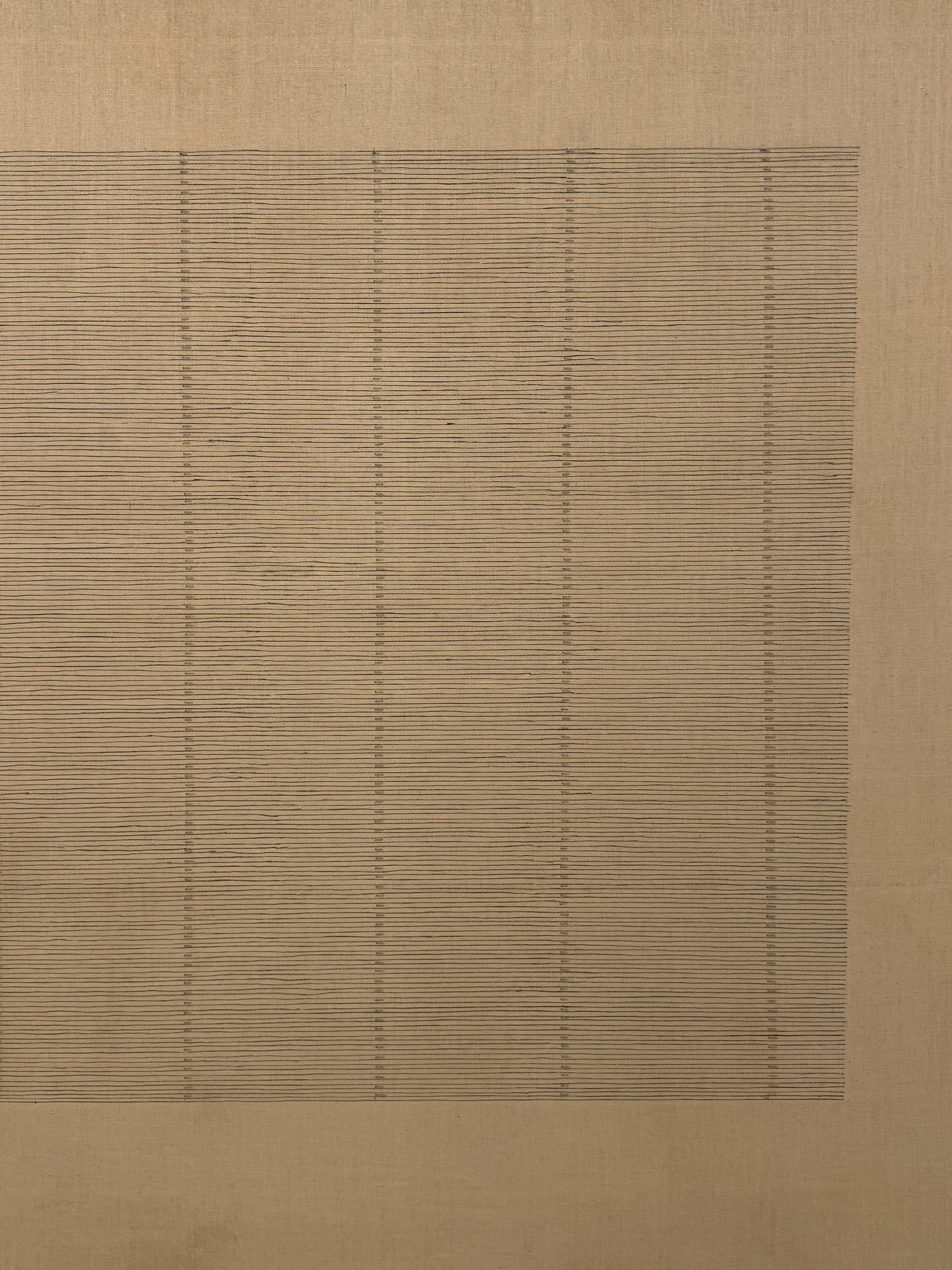
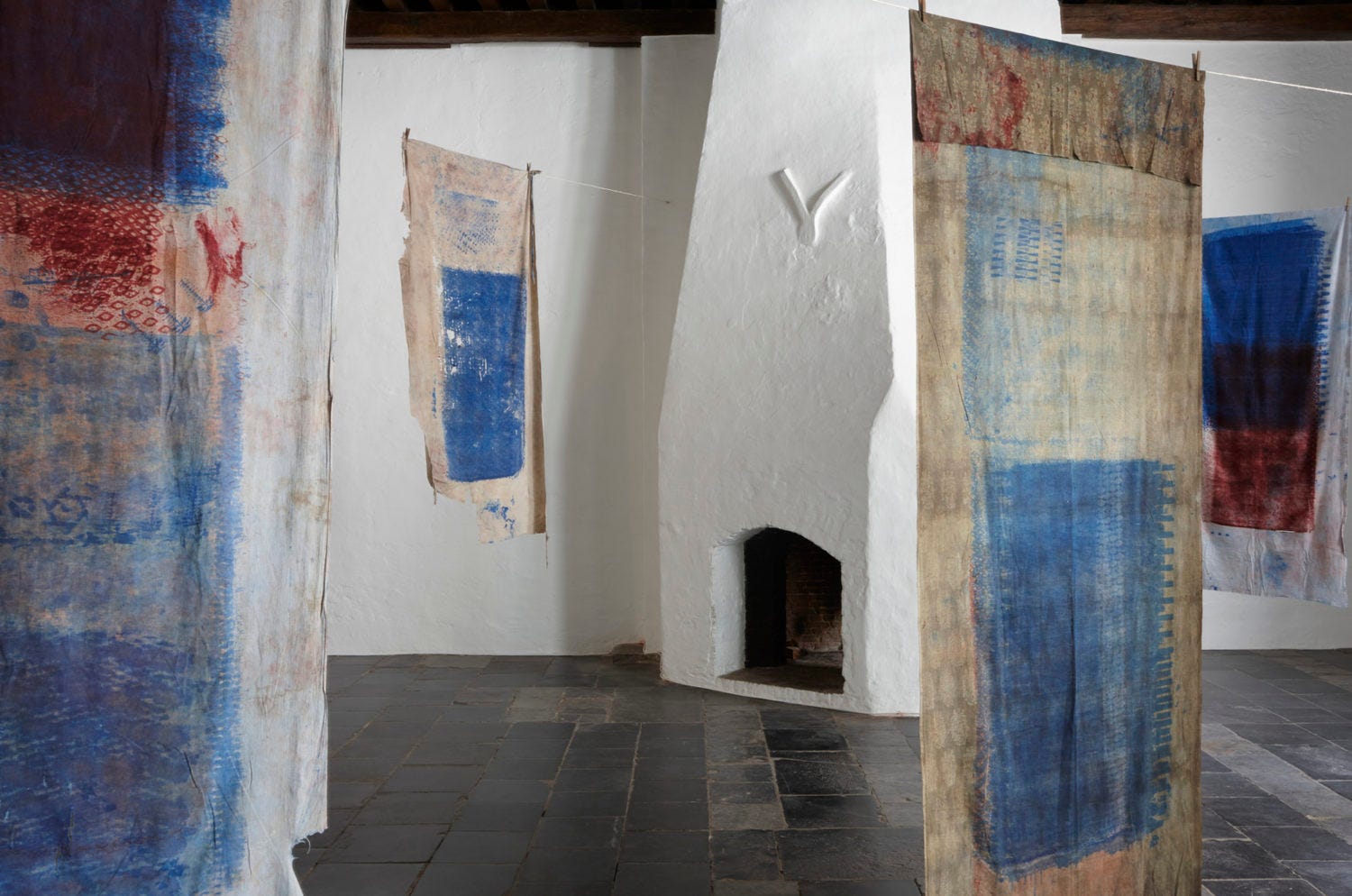
But the real shift happened when I started noticing stripes in places where no one intended them to be decorative at all. Like the Agnes Martin paintings in the Minimal show at the Bourse in Paris. I went in thinking I would take a quick cultured lap and leave. Instead I found myself nose to canvas, squinting at these nearly invisible lines that somehow made the entire room exhale. Her grids felt like the interior life of a stripe. Steady, quiet, self possessed. They were not trying to impress anyone. They were simply being.
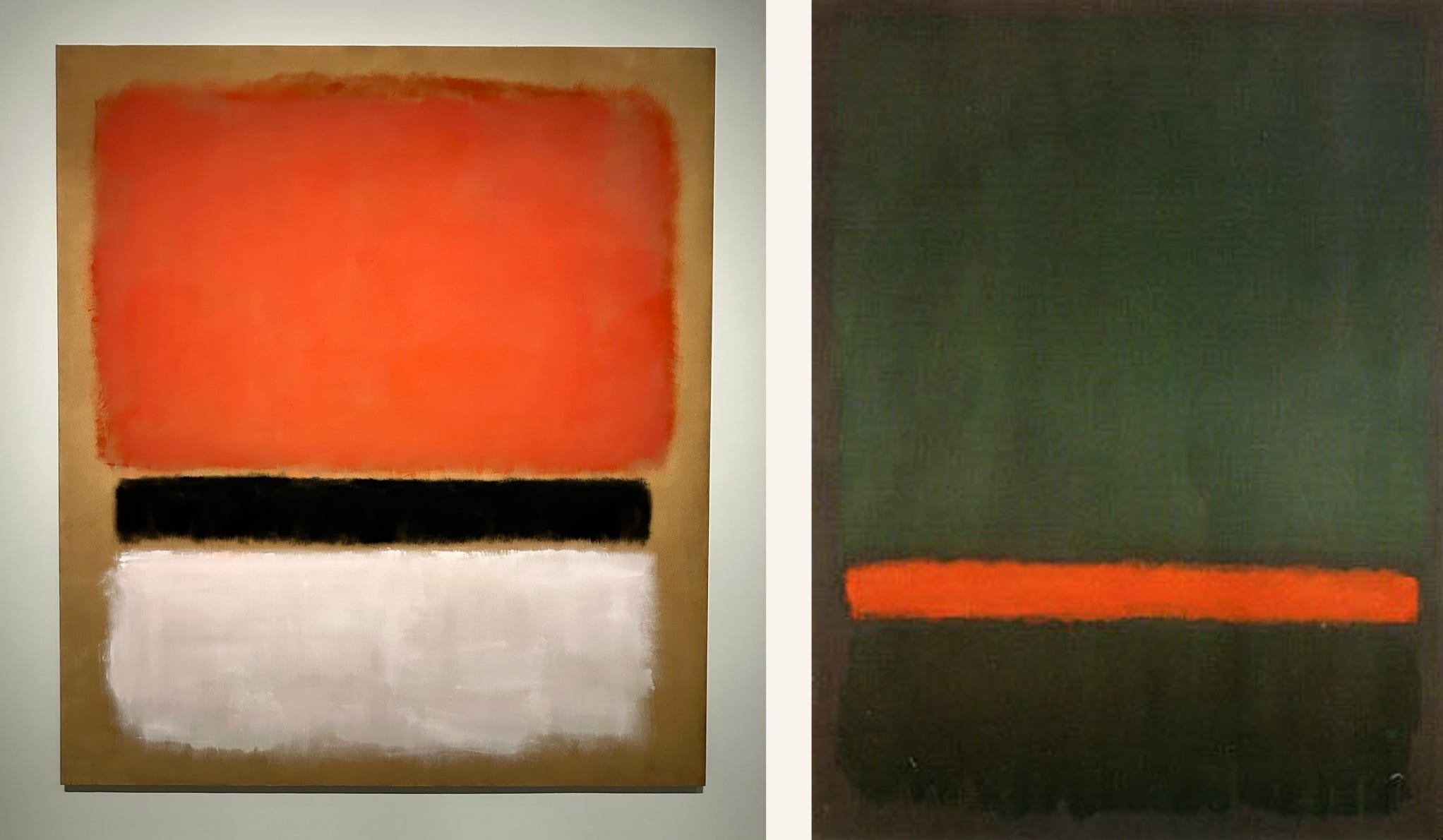
And then there was Rothko at the Louis Vuitton Foundation. Those horizontal fields were not stripes in the literal sense but they behaved like them. Stacked color holding the viewer in suspension, creating a kind of slow attention that felt almost like prayer.
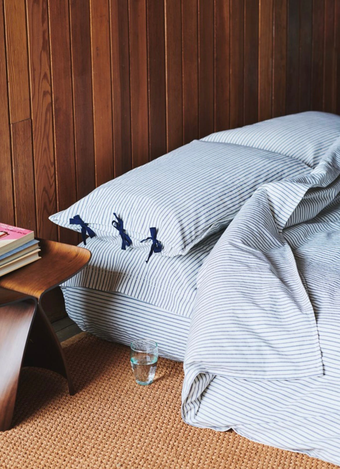
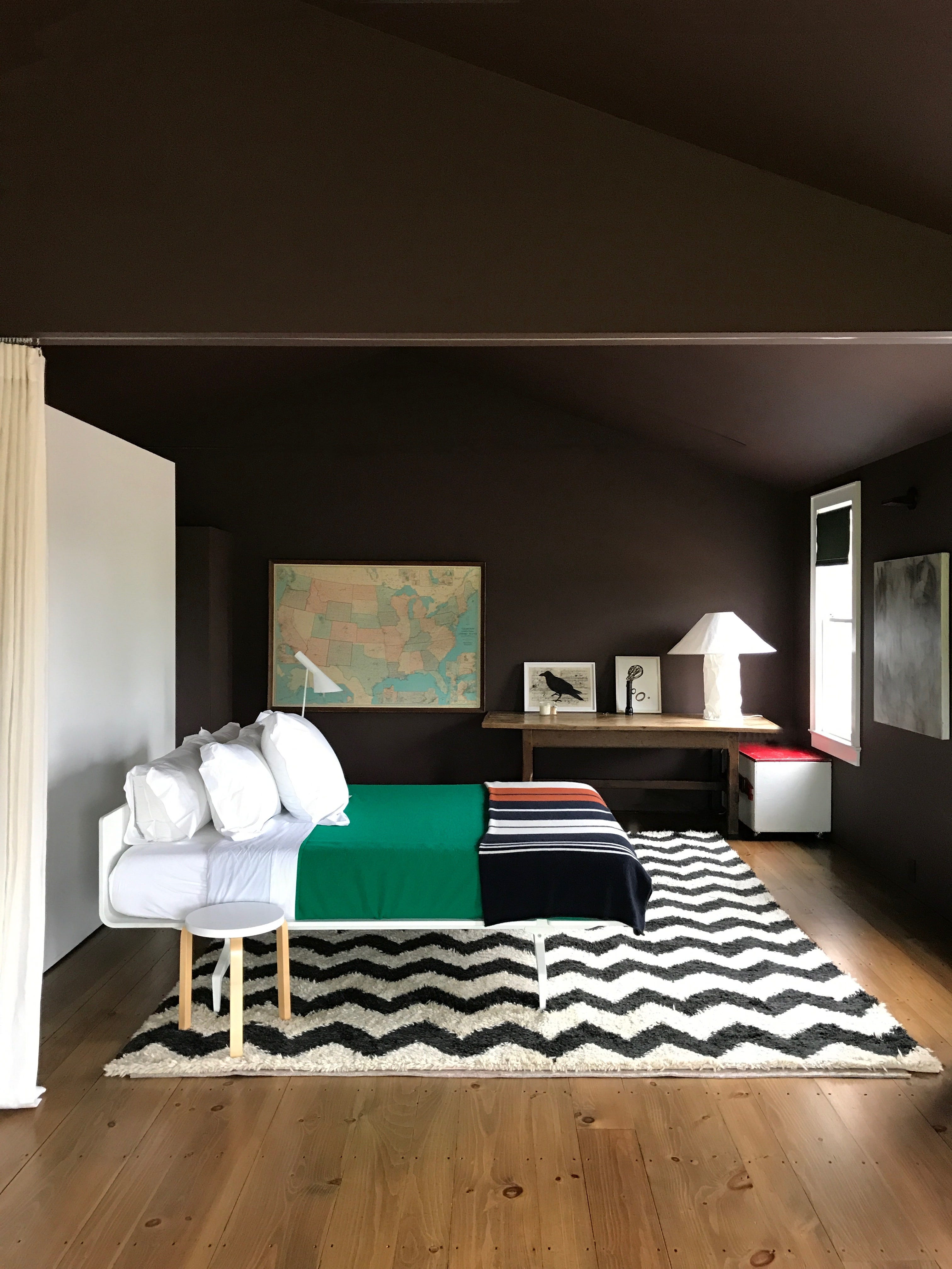
Because a stripe does not just decorate. It directs. It moves the eye. It sets boundaries. It teaches you something about scale about what feels too thick, too thin, too spaced, too crowded. In styling it becomes a kind of scaffolding. The thing that lets the other pieces feel loose, off center, human.
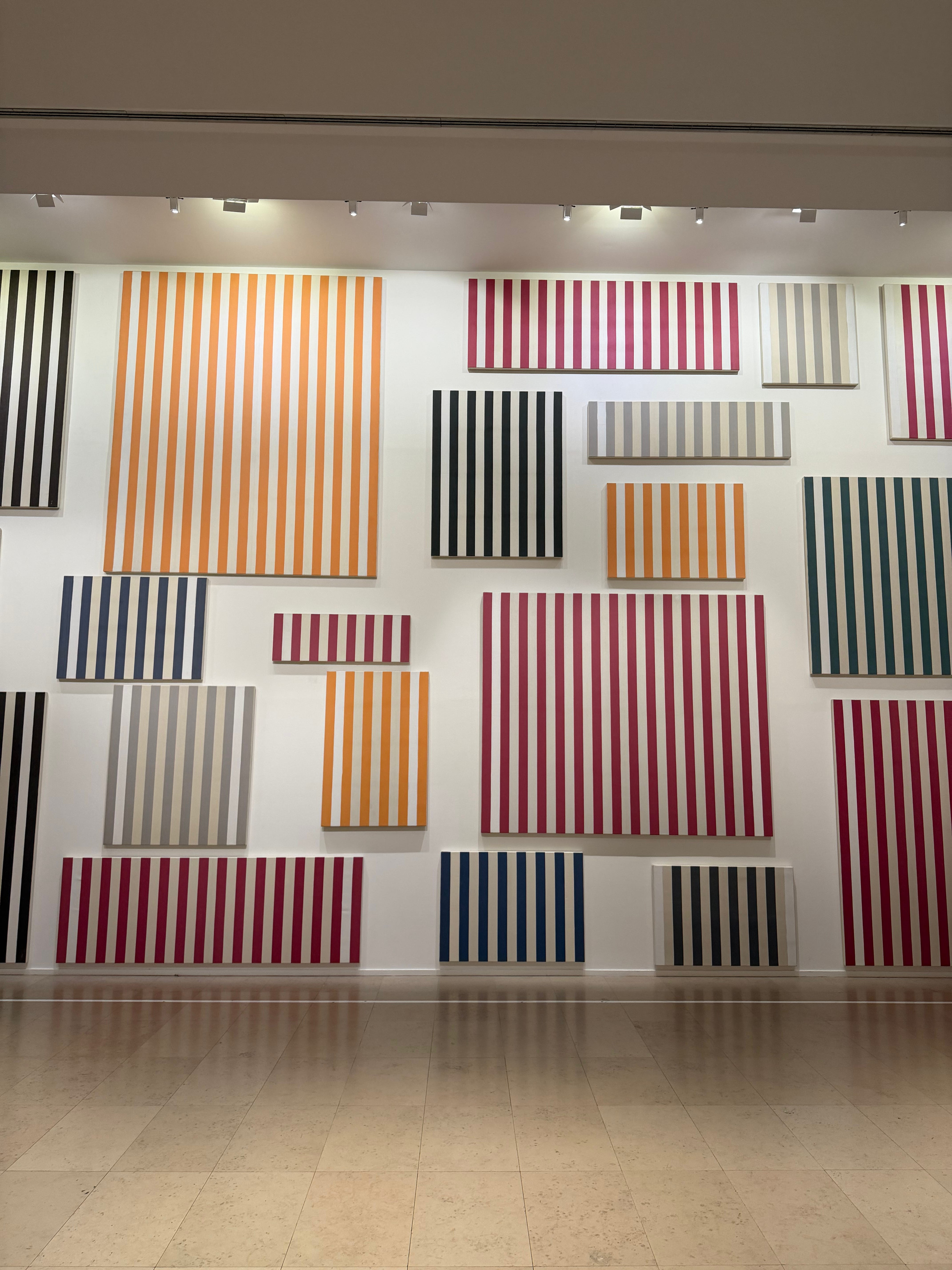
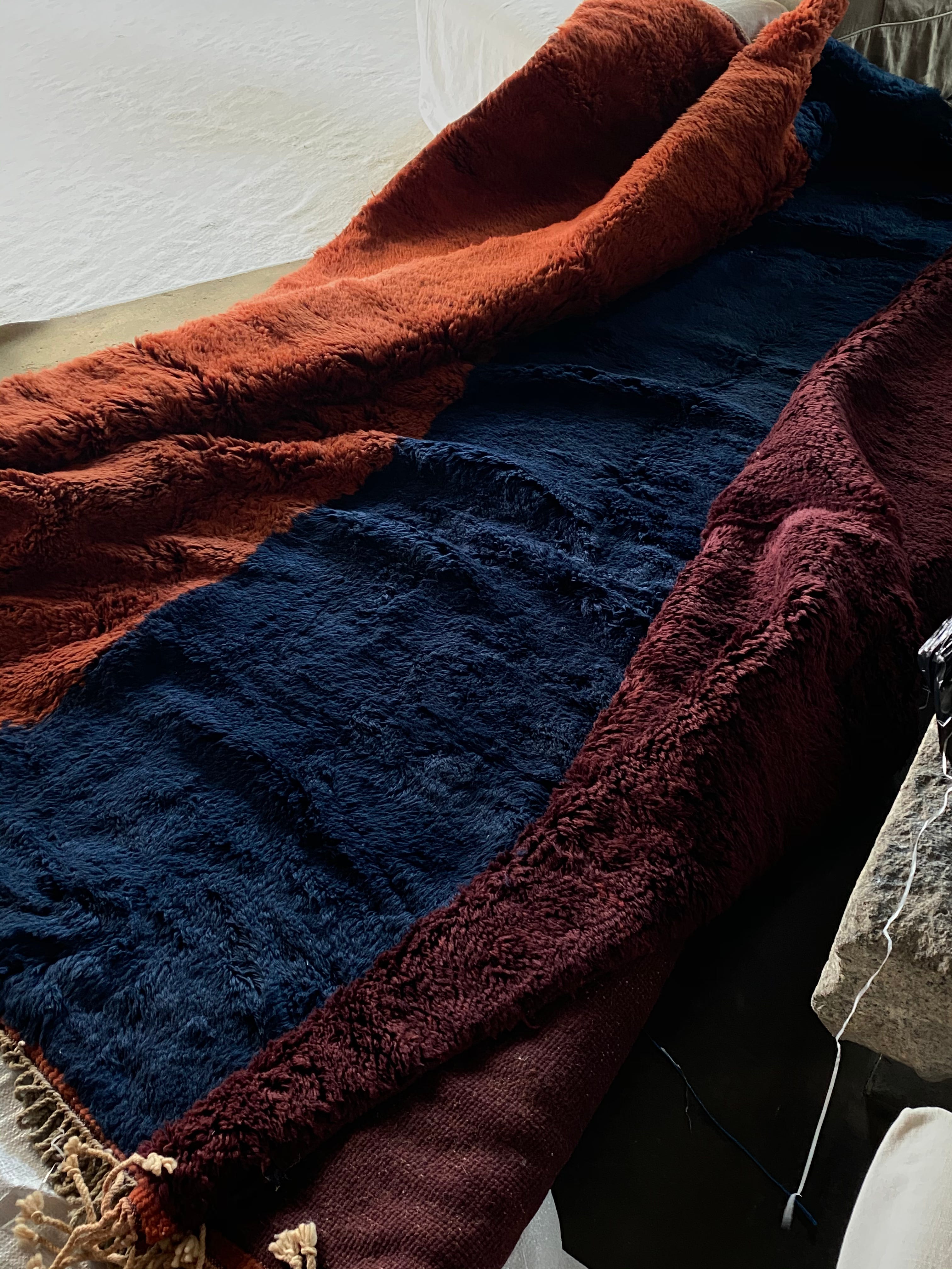
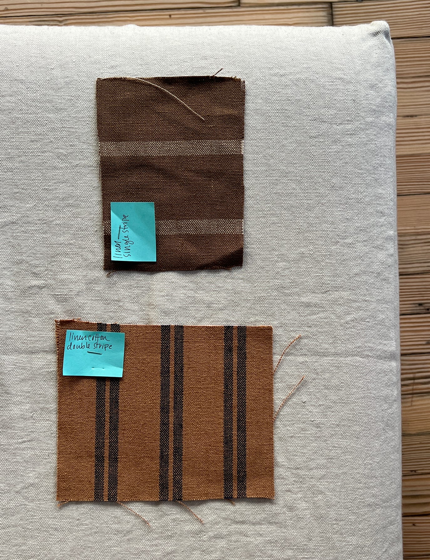
My relationship to stripes shifted further when I began designing with them. My first collection with Beni, The Shape of Color, taught me more than I intended to learn. I thought I was making a study of tone but really I was discovering how color behaves inside structure. How a line can calm a hue or give it a place to land. By the time I worked on my next collection, Chroma I, I understood the lesson. What began as another study in color became something quieter. A study in structure itself. We wove in flatweave because the formality of the stripe and the ease of the texture felt honest. And I was surprised by how the boldest pairings Sahara Brown with Tangerine, Deep Red with Pinecone became surprisingly gentle once they lived inside a stripe. A thick line softened everything. Proportion tempered hue. Even my louder instincts felt more manageable inside that kind of clarity.
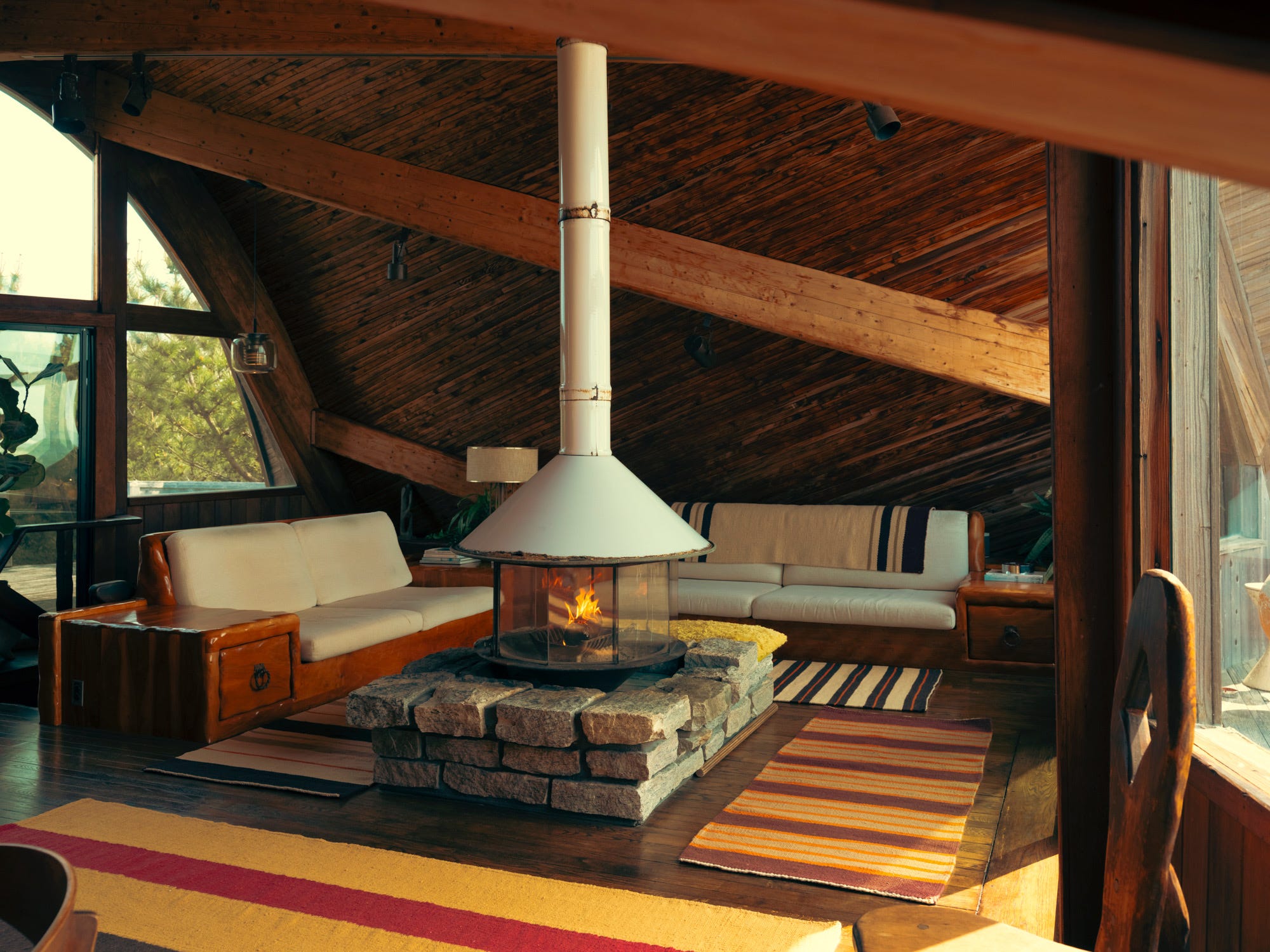
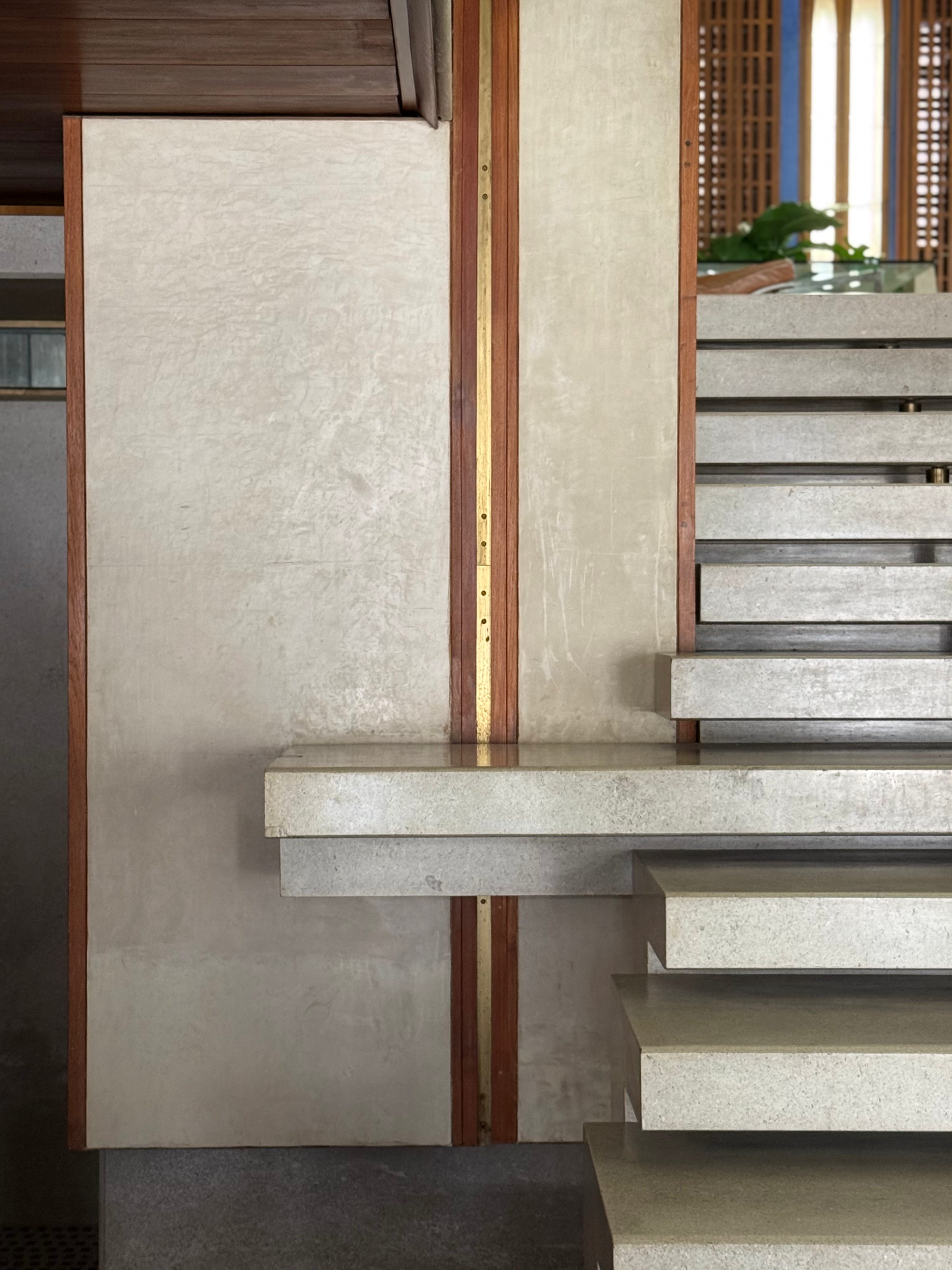
Some of the best interior spaces I know use stripes not as accents but as structure. Axel Vervoordt does this beautifully in his linen wall hangings, where the lines are so subtle they almost disappear but still fill the room with vertical calm. Jacques Grange does it in the opposite way. At the Mark Hotel he lets stripes behave like quiet architecture. They frame, they guide, they hold luxury in place so it does not drift into indulgence. In his own projects he tucks stripes into upholstery and rugs and even the edge of a doorway where they make the space feel taller, more intentional. He uses them the way a dancer uses posture. Not for show. For alignment.
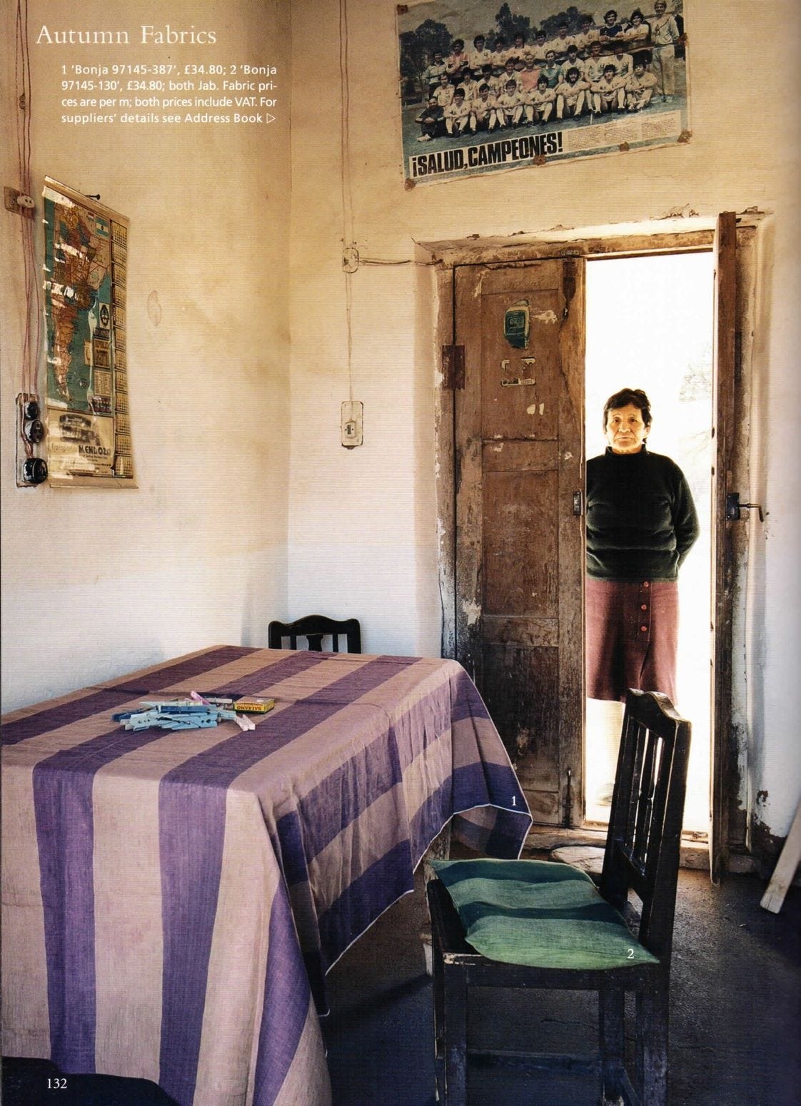
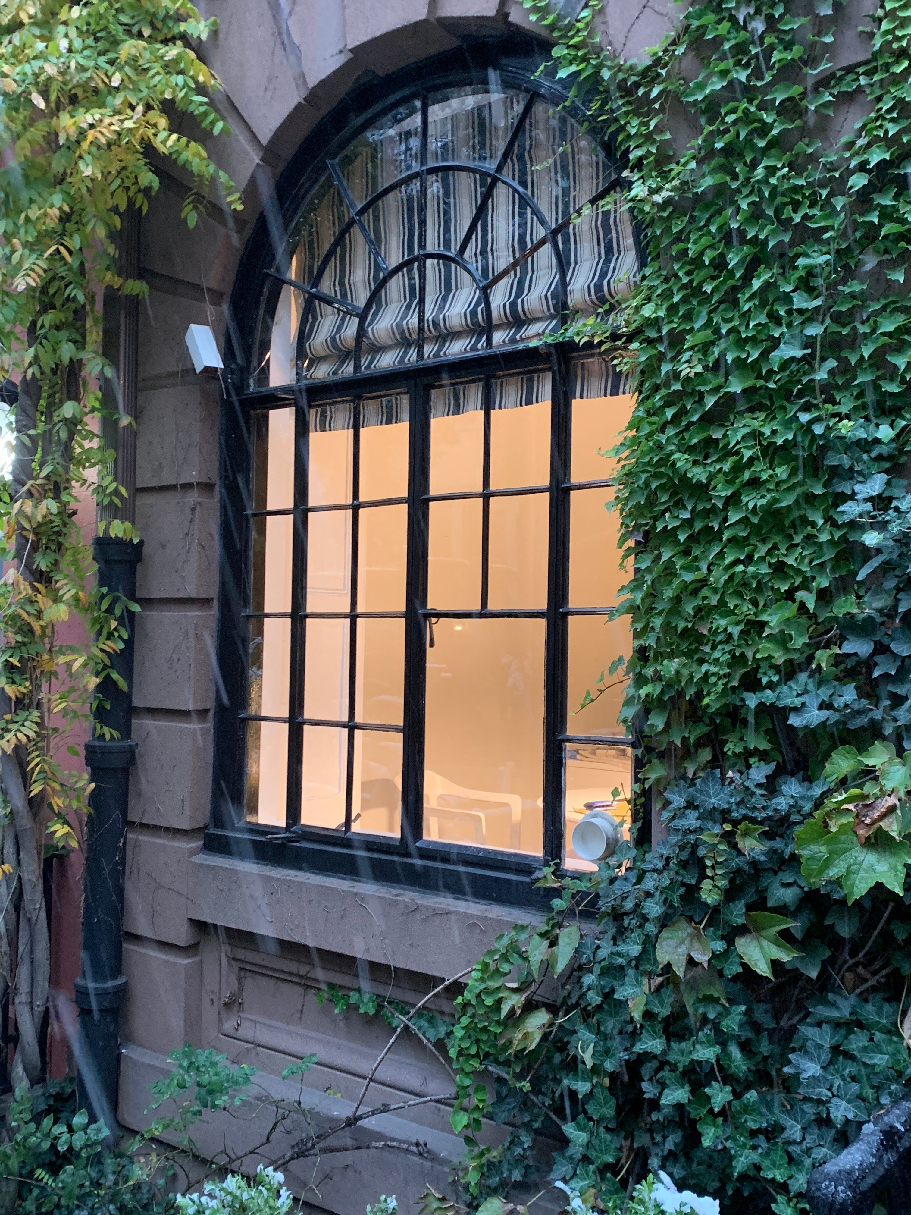
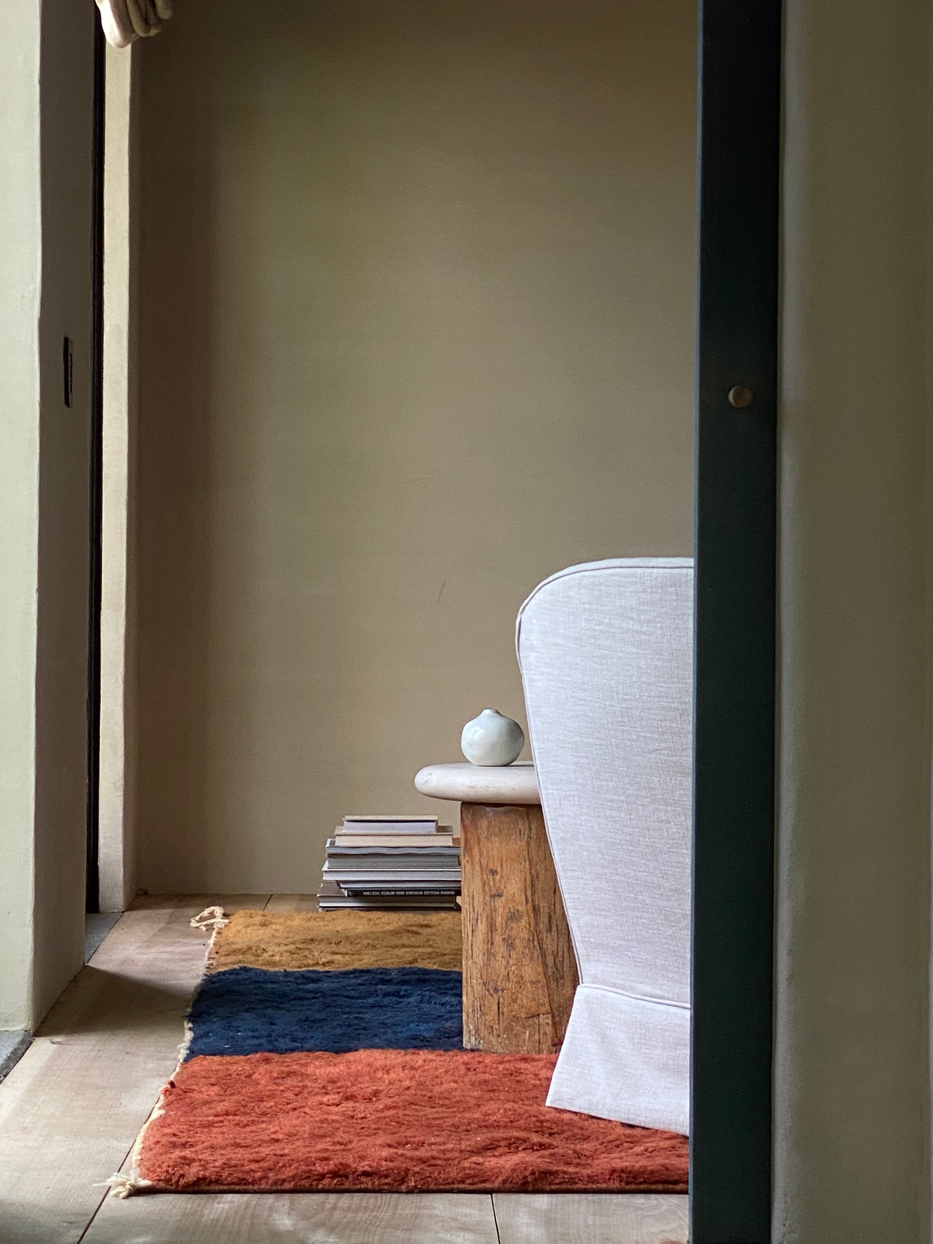
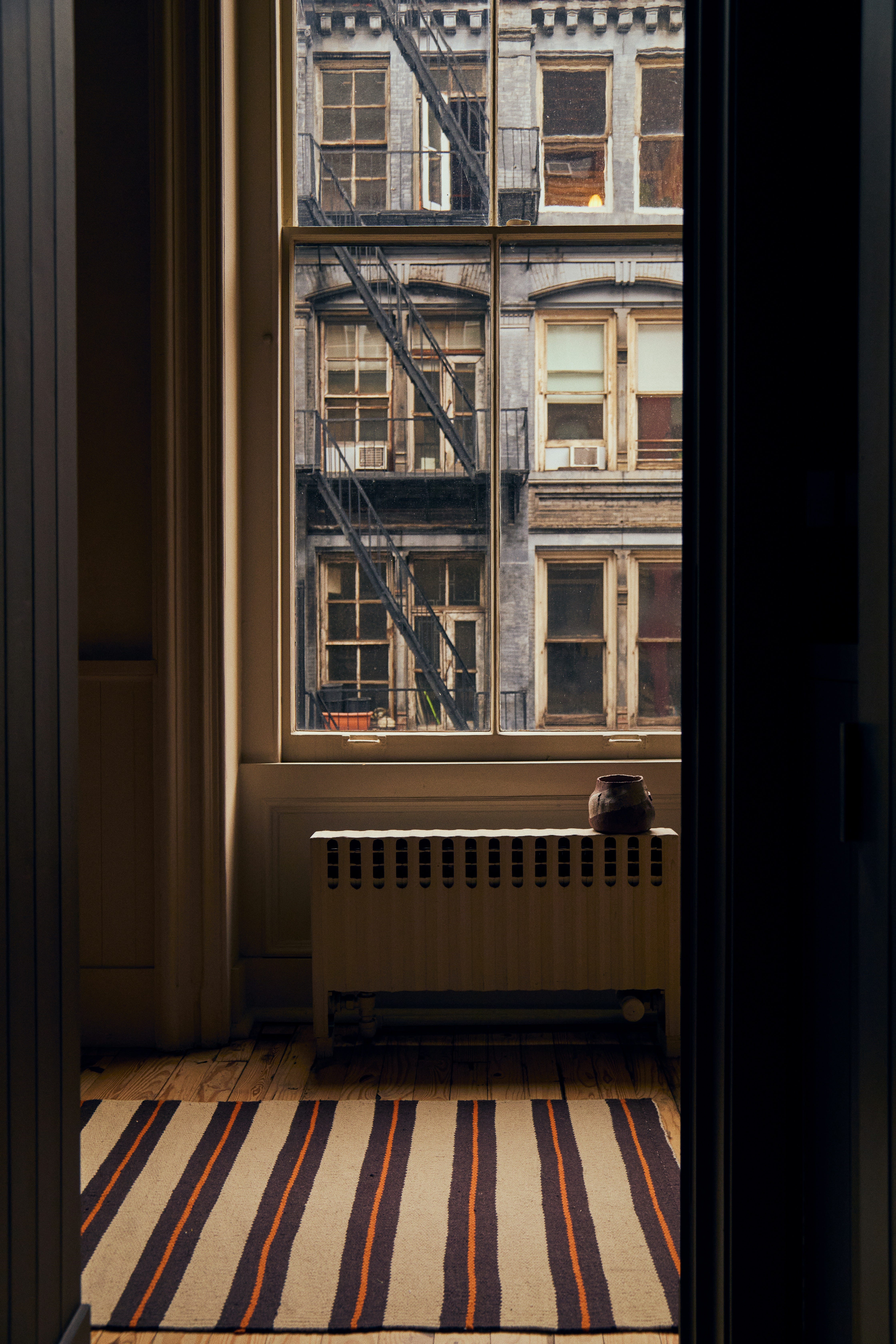
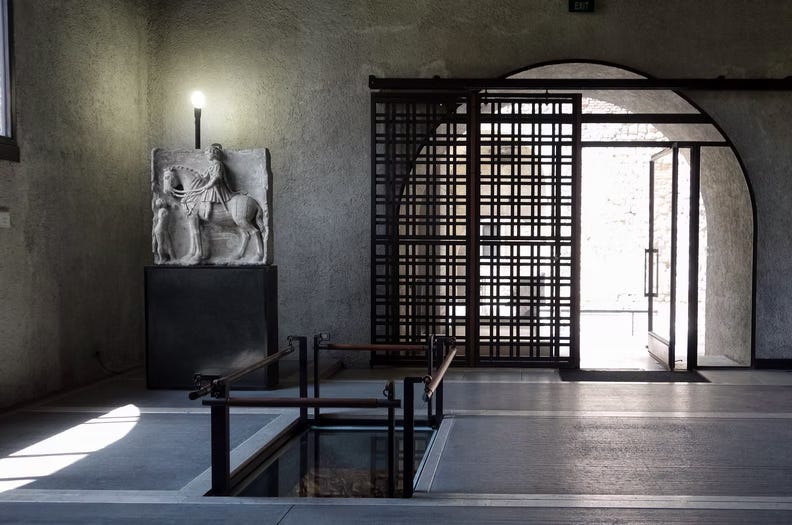
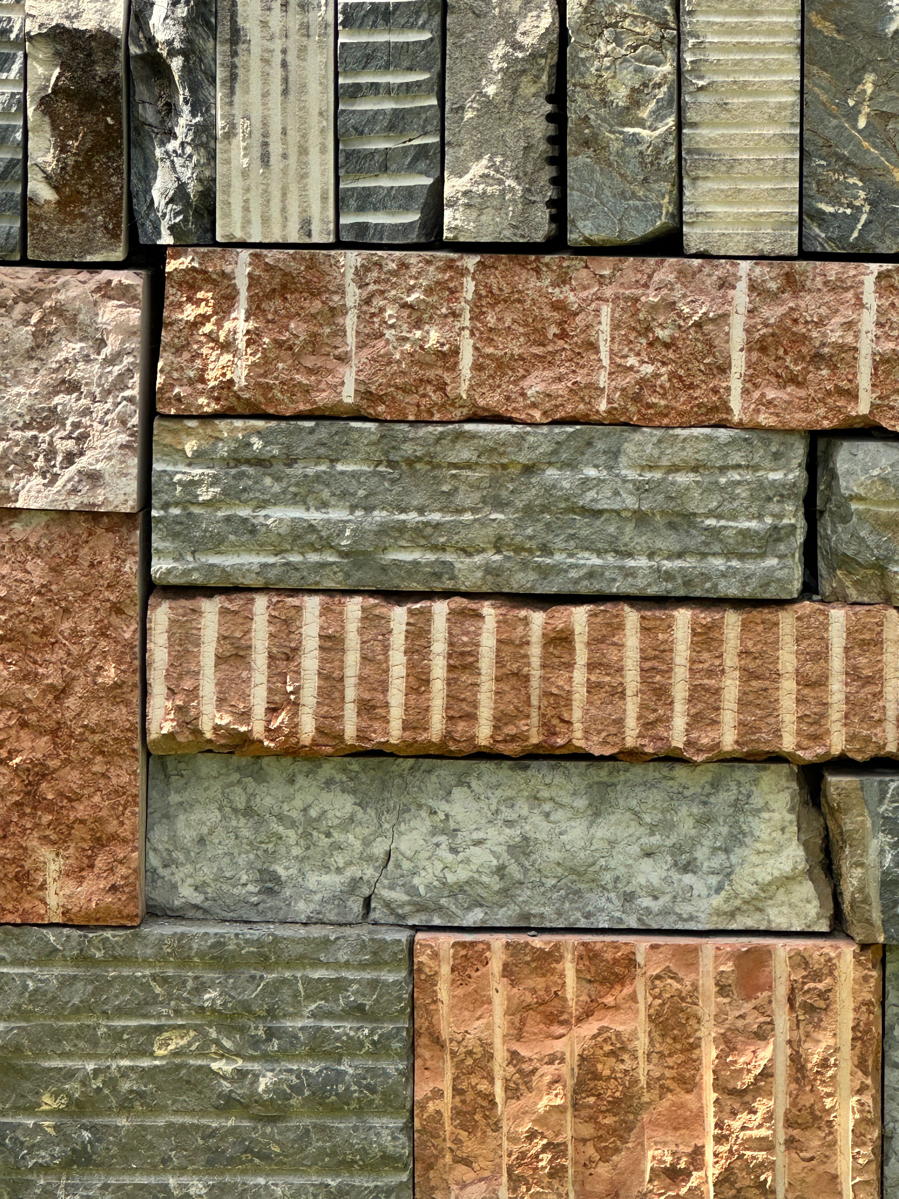
A simple blind in a Milan apartment can filter light into long ribbons across the floor. Scarpa’s floors do the same thing with stone. Charlotte Perriand’s cabinetry does it with wood. Even a striped napkin on an empty table can give the whole room a starting point.
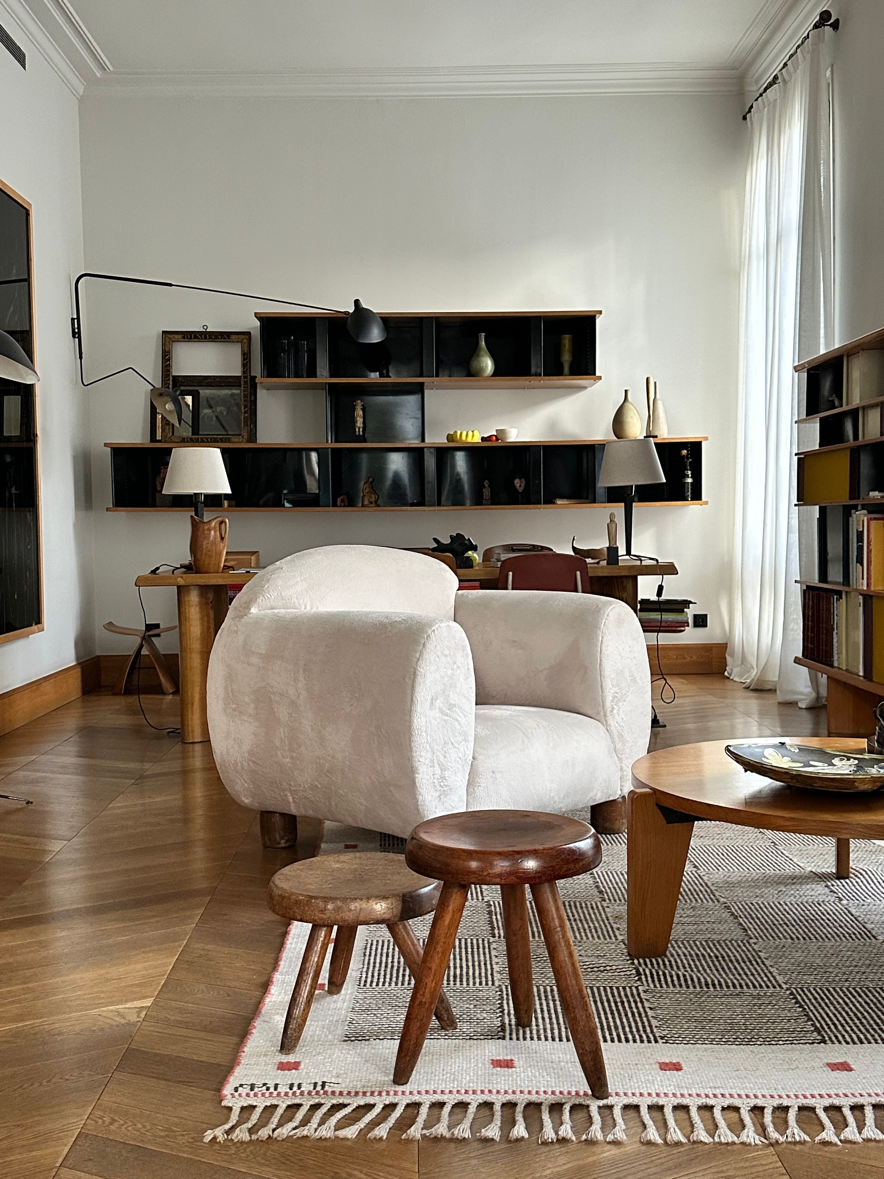
That’s the power of a stripe. It organizes. It composes. It simplifies the conversation so the materials can do the talking. When I am styling with stripes, I think in opposites. A crisp line beside something soft. A wide band next to something wild. The contrast sharpens the presence of both. If the rug is patterned, I keep the furniture quiet. If a vase carries a line, I let the stems be unruly. It is not about matching. It is about balance. What is carrying weight. What is letting go.
My personal rule: let one thing speak. Let the stripe be the line that holds everything else in.
Some of my favorite stripes
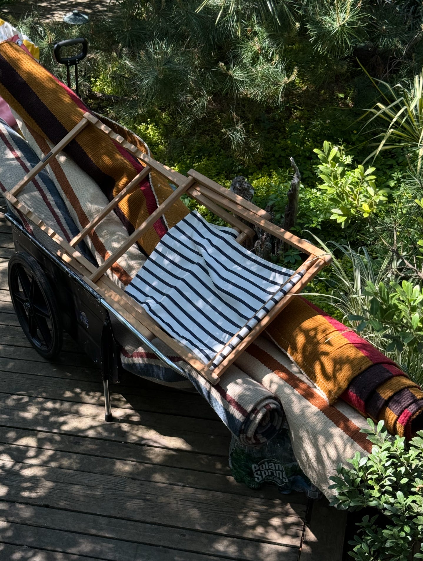
A curtain with uneven spacing, made from a bolt of deadstock canvas I found in Paris
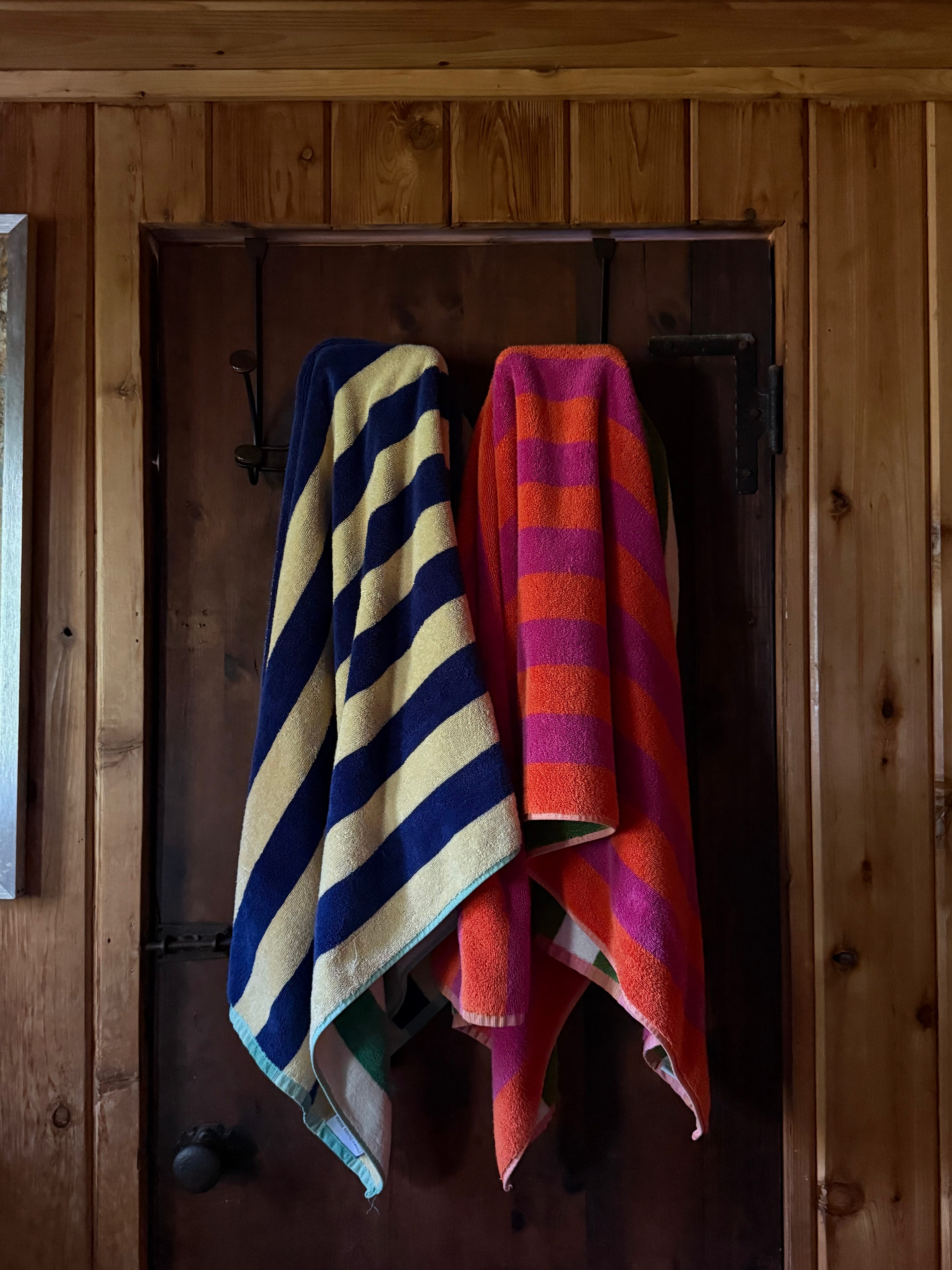
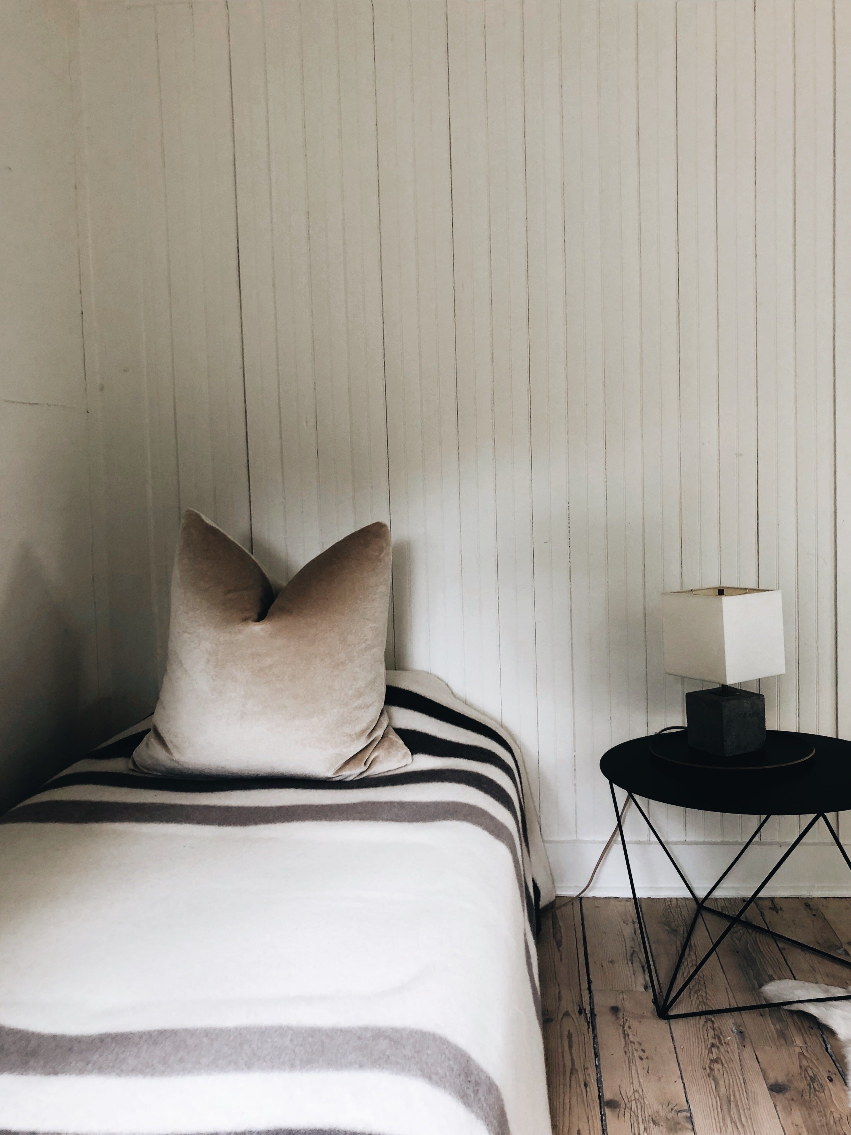
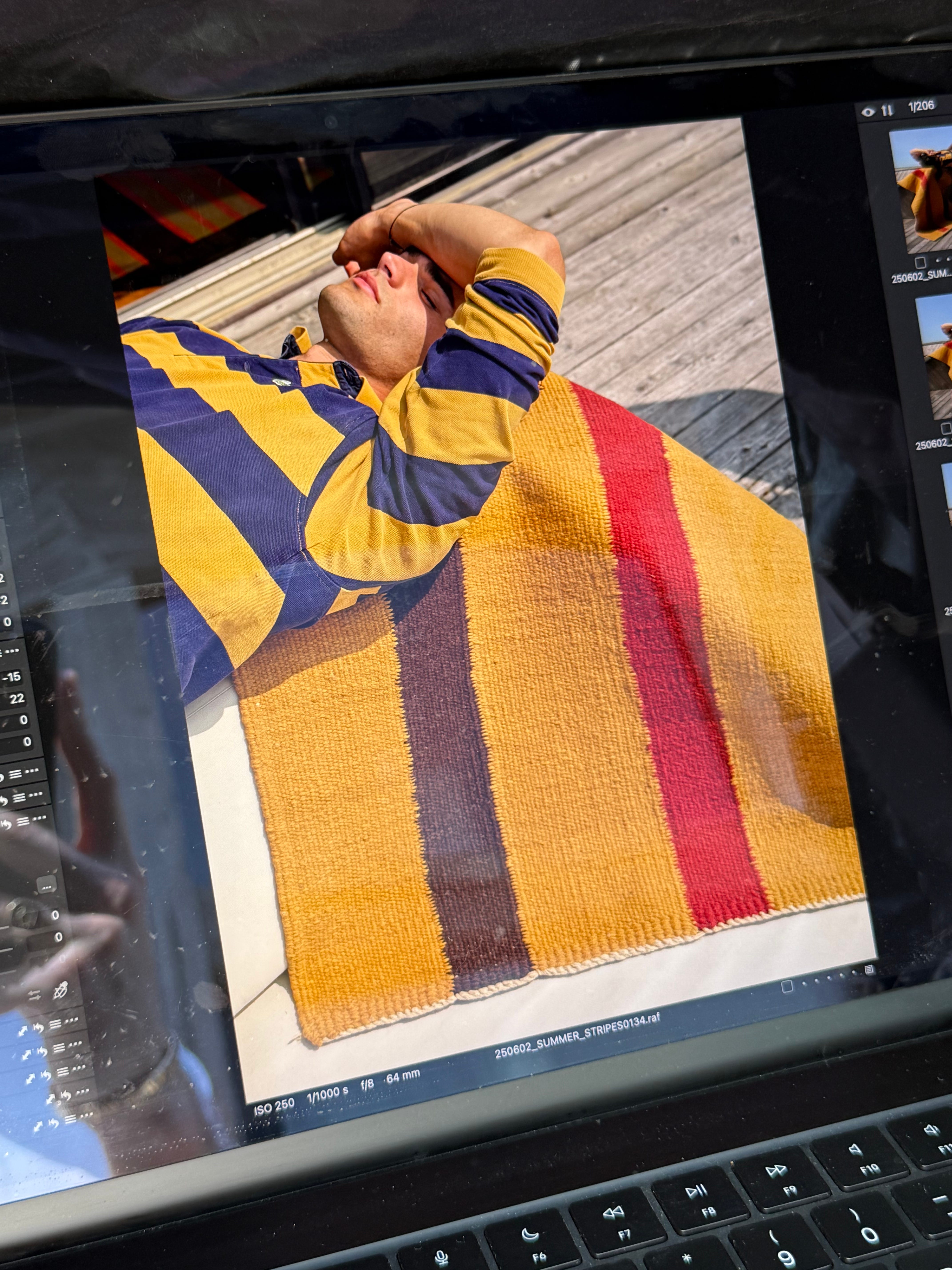
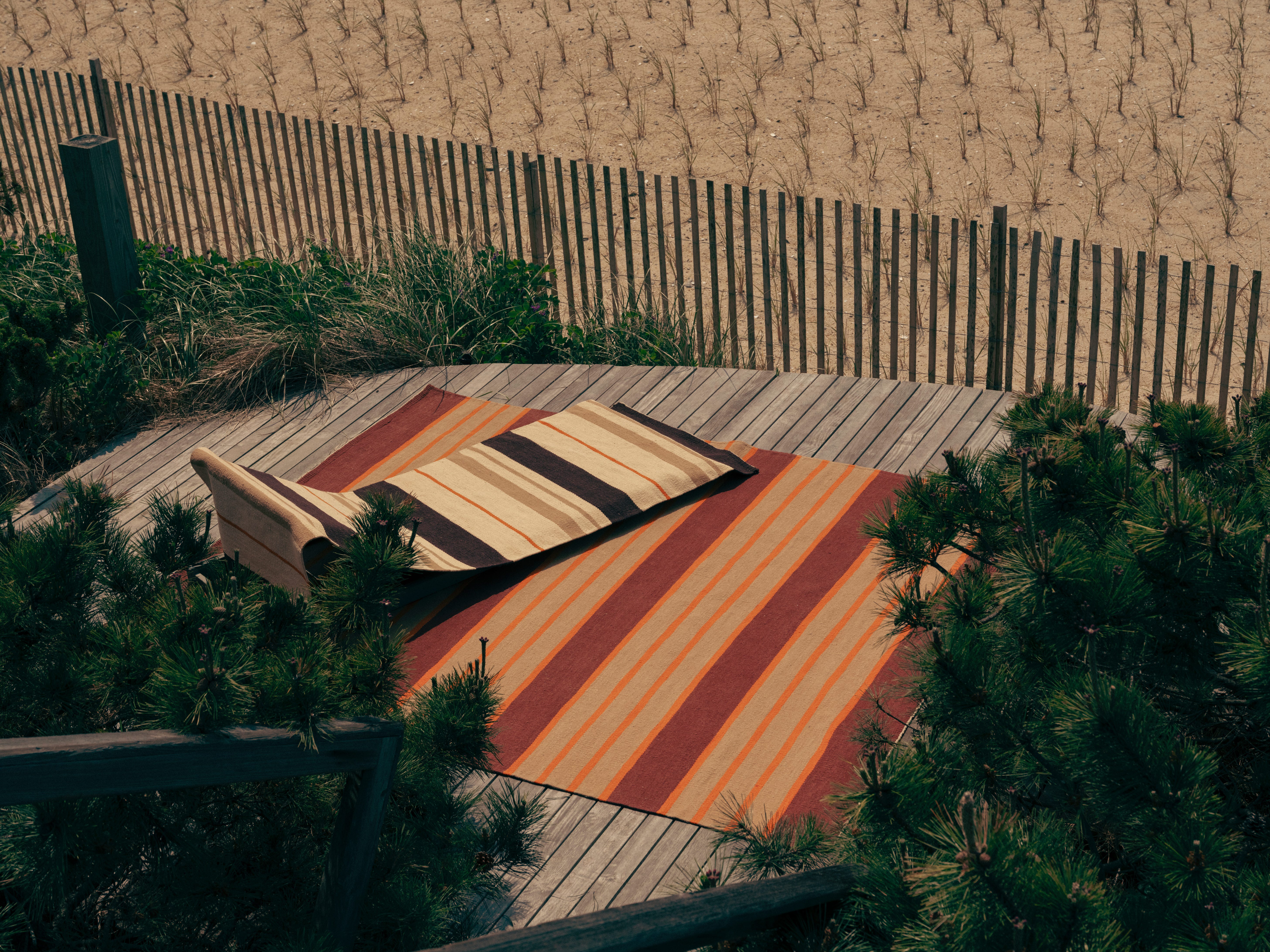
A beach towel folded on a stool in the entryway
A narrow band of dark blue on a cream dinner plate
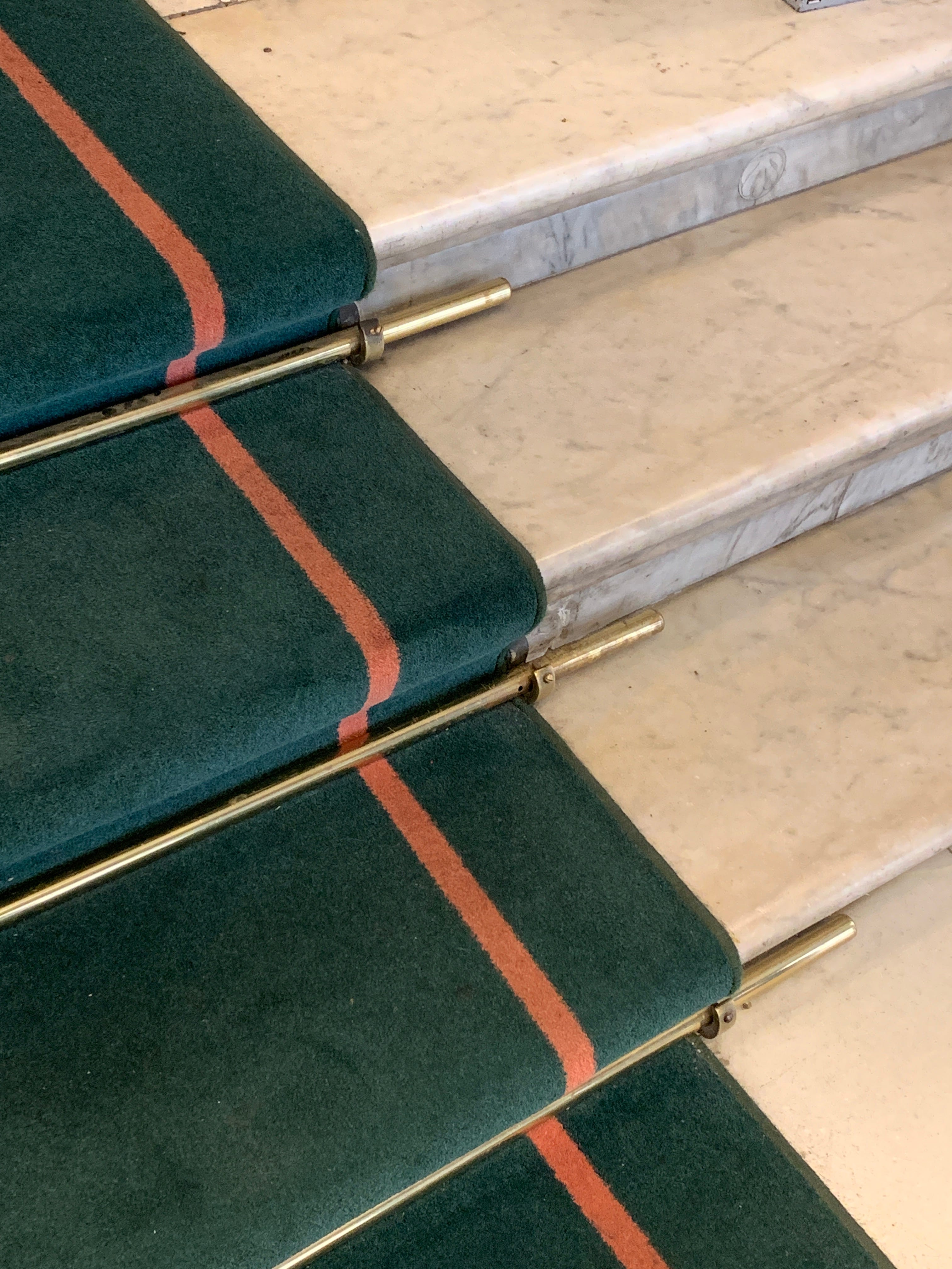
A hallway runner that looks stretched, almost too long exactly right
A ladder back chair with two stripes worn into the seat from use
I think the reason I keep coming back to stripes is because they hold both clarity and imperfection. They feel finished but never fussy. Styled but never staged.
So the next time a room feels scattered, try placing a single stripe. A pillow. A runner. A framed textile. Let it clarify the space. Watch what begins to settle around it.
Love,
Colin

Beautifully crafted post. It was a joy to read! Thank you.
this is just beautiful, loved it all the way through